Implement a custom radio input
-- 2 min read
The browser is generous enough to give us default stylings for input elements. However, that styling might be insufficient because we want the inputs to match the theme of our application.
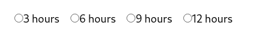
In this article we will learn how to build a custom radio input like the one shown below:
Implementation
We need to be able to select only one choice at a time; therefore we need to use a radio input. Using a radio input instead of a div ensures that we maintain the accessibility features like keyboard navigation. We will then style the radio input to match our desired design.
Let's start by creating a radio input component:
// /components/RadioInput.jsx

function RadioInput() {
  return (
    <label>
      3 hours
          <input
              type="radio"
              name="duration"
              value="3hrs"
            />
    </label>
  );
}
This will render a radio input with the default browser styles
Now let's style the radio inputs to look like what we want. We will be using Tailwind utility classes for our styling. First let's get rid of the default styling by setting " appearance: none" using the appearance-none tailwind utility class.
// /components/RadioInput.jsx

function RadioInput() {
  return (
    <label>
      3 hours
          <input
              type="radio"
              name="duration"
              value="3hrs"
              className="appearance-none"
            />
    </label>
  );
}
After getting rid of the default styling, let's style the <label> to have a gray background and a green outline when active.
// /components/RadioInput.jsx
import { Check } from "/components/Icon";

function RadioInput({ isSelected }) {
  return (
    <label className={`bg-gray-100 py-12 ${isSelected ? 'outline outline-green-500': ''}`}>
          <input
              type="radio"
              name="duration"
              value="3hrs"
              className="appearance-none"
            />
      <div className="absolute inset-0 grid place-items-center">
        <div className="text-center">
            <p className="font-semibold text-xl">3 hours</p>
            <p className="mt-2">Min stake:
              <span className="font-semibold">$ 20</span>
            </p>
        </div>
                {isSelected && <Check className="text-green-500 absolute left-2 bottom-2" />}

            </div>
    </label>
  );
}
The <div> after the <input> contains all the text that we see in the user interface (the duration and minimum stake).
Now we have a custom radio input without sacrificing the accessibility features. That's it 👋🏾. Go and implement accessible custom radio inputs.
