Accessible website form inputs
-- 2 min read

Accessibility is a very important aspect when building your website as it ensures most people can use your website. Most developers overlook certain groups of people e.g visually impaired, as they focus on visual users. To ensure your website is usable it should not only be usable through the visual user interface, but also via the keyboard and other assistive technologies such as screen readers.
Implementation
Let's see how we can make a form accessible. We will learn how inaccessible form inputs look like and how to implement the best practices to make them accessible. Let's get started.
Wrong way (inaccessible) ❌
First let's see how form input should not look like. Your form inputs should not look like the following at all costs.
<!DOCTYPE html>
<html lang="en">
<head>
    <meta charset="UTF-8" />
    <meta name="viewport" content="width=device-width, initial-scale=1.0" />
    <title>Inaccessible form inputs</title>
</head>
<body>
    <form method="post">
      <span>Email</span>
      <input placeholder="Enter your email" />

      <span>Name</span>
      <input placeholder="Your name" />

      <span>Phone</span>
      <input placeholder="Your phone" />

      <button>Click</button>
    </form>
</body>
</html>
A visual user may be able to understand what is required but someone using a keyboard or a screen reader cannot use the form. They will have a hard time understanding what the form inputs mean and what actions are to be taken by the form.
What is wrong with this implementation?
- The developer used <span> tags to label the form input instead of a label tag. A <label> creates an association between a form input and its label.
- The developer did not provide a clear descriptive text on the button describing which the button would do.
Correct way (accessible) ✅
To make the form above accessible we will associate each form input with a label and use a descriptive text in the button instead of 'Click'.
<!DOCTYPE html>
<html lang="en">
<head>
    <meta charset="UTF-8" />
    <meta name="viewport" content="width=device-width, initial-scale=1.0" />
    <title>Accessible form inputs</title>
</head>
<body>
    <form method="post">
      <label for="email">Email</label>
      <input
        type="email"
        name="email"
        id="email"
        placeholder="abc@example.com"
      />

      <label for="name">Name</label>
      <input
        type="text"
        name="name"
        id="name"
        placeholder="John Doe"
      />

      <label for="phone">Phone</span>
      <input
        type="text"
        name="phone"
        id="phone"
        placeholder="0712 345 678"
      />

      <button type="submit">Submit</button>
    </form>
</body>
</html>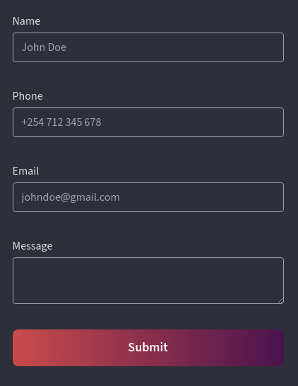
To associate a label with a form input, provide a for attribute to the <label> element and an id attribute to an <input> element. The value provided to "for" should be the same as the "id" value in the <input>. This way one can access the input elements via the keyboard and the screen reader will read the label for the form input. This helps the user to understand what the inputs mean.
We also used a descriptive text for the button in the form. When a user focuses the button the screen reader will announce 'Submit' instead of 'Click'. This gives a user an idea of what action will happen in the form.
The placeholder values are helpful for both visual and visually impaired users. Visual users will see the hint provided by the placeholder and a visually impaired user will be read the hint. Therefore, one should use helpful placeholders.
Focus management and error messages
The above form is accessible to some extent. A user can easily interact with it while filling it out but what happens if there is an error after submitting the form? A visual user can see the error message, but a visually impaired user will miss the error message. Let's see how we can fix that.
First let's see how we can display error messages to a user. I am using Remix for the rest of the examples. I want to show how we can do focus management quite easily using React.
If there is an error after submitting a form, the data returned from the server is available using the useActionData() hook which is provided by Remix. We display the validation error returned right next to the input's label.
import { Form, useActionData } from "@remix-run/react";
export default function Contact() {
let actionData = useActionData();
return (
<main>
<h1>Contact </h1>
<Form method="post">
<label htmlFor="name" className="text-body-white">
Name
{(actionData?.fieldErrors?.name)
? (<span className="text-red-500 ml-2"> {actionData.fieldErrors.name}
</span>)
: <> </>
}
</label>
<input
ref={nameRef}
type="text"
name="name"
id="name"
placeholder="John Doe"
/>
<button type="submit">Submit</button>
</Form>
</main>
);
}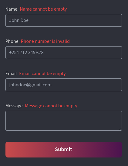
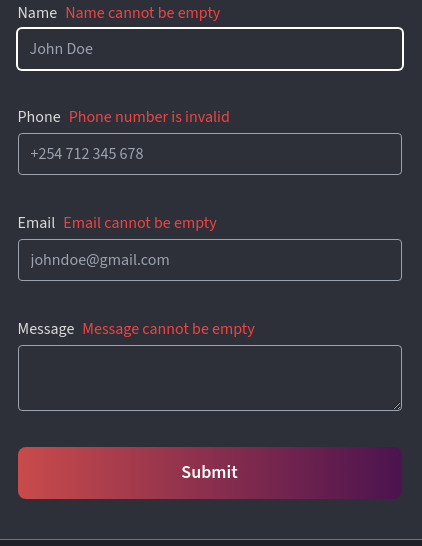
A visual user will be able to see the error next to the label but a person using a screen reader will not know there is an error. To fix this is quite simple. All we need to do is focus the input that has the error and add an aria-describedby attribute to the input and a corresponding 'id' attribute to the error message.
import { Form, useActionData } from "@remix-run/react";
import { useRef, useEffect } from "react";
export default function Contact() {
let actionData = useActionData();
let nameRef = useRef(null);
useEffect(() => {
// If we have an error, focus the element
if (actionData?.fieldErrors.name) {
nameRef.current.focus();
}
}, [actionData]);
return (
<main>
<h1>Contact </h1>
<Form method="post">
<label htmlFor="name" className="text-body-white">
Name
{(actionData?.fieldErrors?.name)
? (<span className="text-red-500 ml-2" id="name-error"> {actionData.fieldErrors.name}
</span>)
: <> </>
}
</label>
<input
ref={nameRef}
type="text"
name="name"
id="name"
placeholder="John Doe"
aria-describedby="name-error"
/>
<button type="submit"Submit</button>
</Form
</main>
);
}Now if the name input has an error, it will be focused and the error mesage will be announced to a user using a screen reader.
That's it 👋🏾.
